


I divide my officers into four classes; the clever, the lazy, the industrious, and the stupid. Each officer possesses at least two of these qualities. Those who are clever and industrious are fitted for the highest staff appointments. Use can be made of those who are stupid and lazy. The man who is clever and lazy however is for the very highest command; he has the temperament and nerves to deal with all situations. But whoever is stupid and industrious is a menace and must be removed immediately!
Mind, I didn't realise when I first read it that it was part of a German military training manual written in 1933. Part of me worries that I'm agreeing with a Nazi (what does removed mean in this context?) and the rest of me dismisses that on the basis that a general writing this in '33 was unlikely to have already been part of the Nazification that took place in the military through the 30s.
I'm half inclined to draw a bubble chart in Excel and then map my company's organisational chart onto it, but that's the kind of thing you include in your last email to the company before you depart, and so it would be safer not to even make a start on it until I'm certain that the jig is up and it's time to move on. I've never been the kind to dismiss the potential for self-sabotage, after all.
Aside from frolics in clarifying differences between personality defects (what's the difference between ignorance and apathy? I don't know and I don't care) I've been skipping lunch in order to draw a glorious stacked bar chart. Due to confidentiality, I can't say what this really does, but I'm still proud of it and I'd like to show you the design, which you may then tell me is horrible. What I'm trying to do is show performance of a particular product (or a particular region, or of stores in a region), and then contrast that with the performance of the same products in a subset of the region. Then, I also want to display some other quantitative information about those products. I could do all this on three separate graphs, but then you'd be flicking back and forth to see which is which, and trying to put them into three graphs on the same page will usually look tacky because things won't line up perfectly.
Here's a sample of it (click to make it bigger).
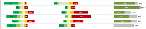
It's actually just a stacked bar with 19 series, of which 6 are rendered invisible to space things out. It would be nice if Excel allowed you to customise the interval between each vertical gridline, rather than have them all the same width apart, but I suppose that isn't going to be possible.
I wonder if anyone will clarify if this has been an example of industriousness, intelligence, stupidity or laziness.

0 comments:
Post a Comment